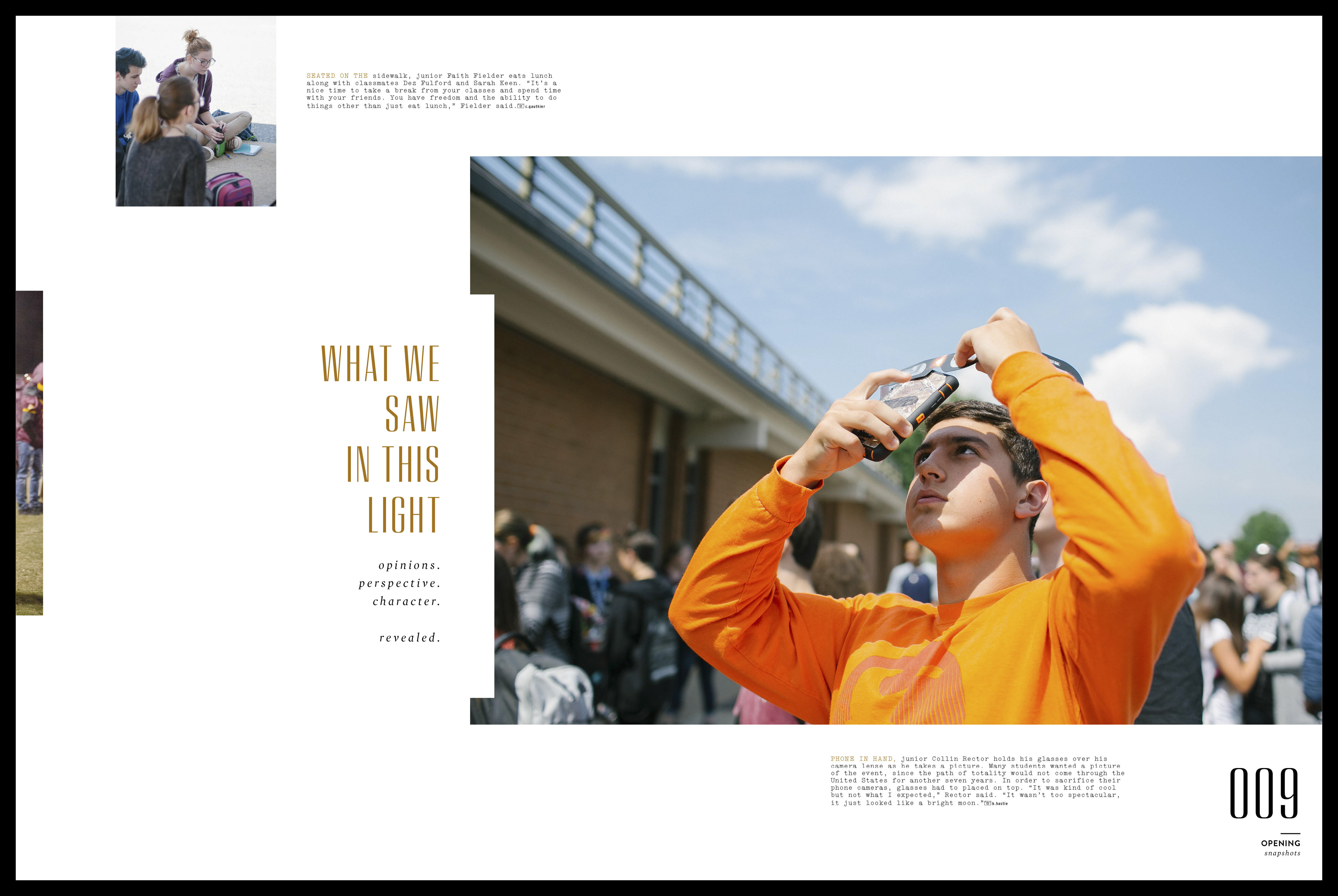
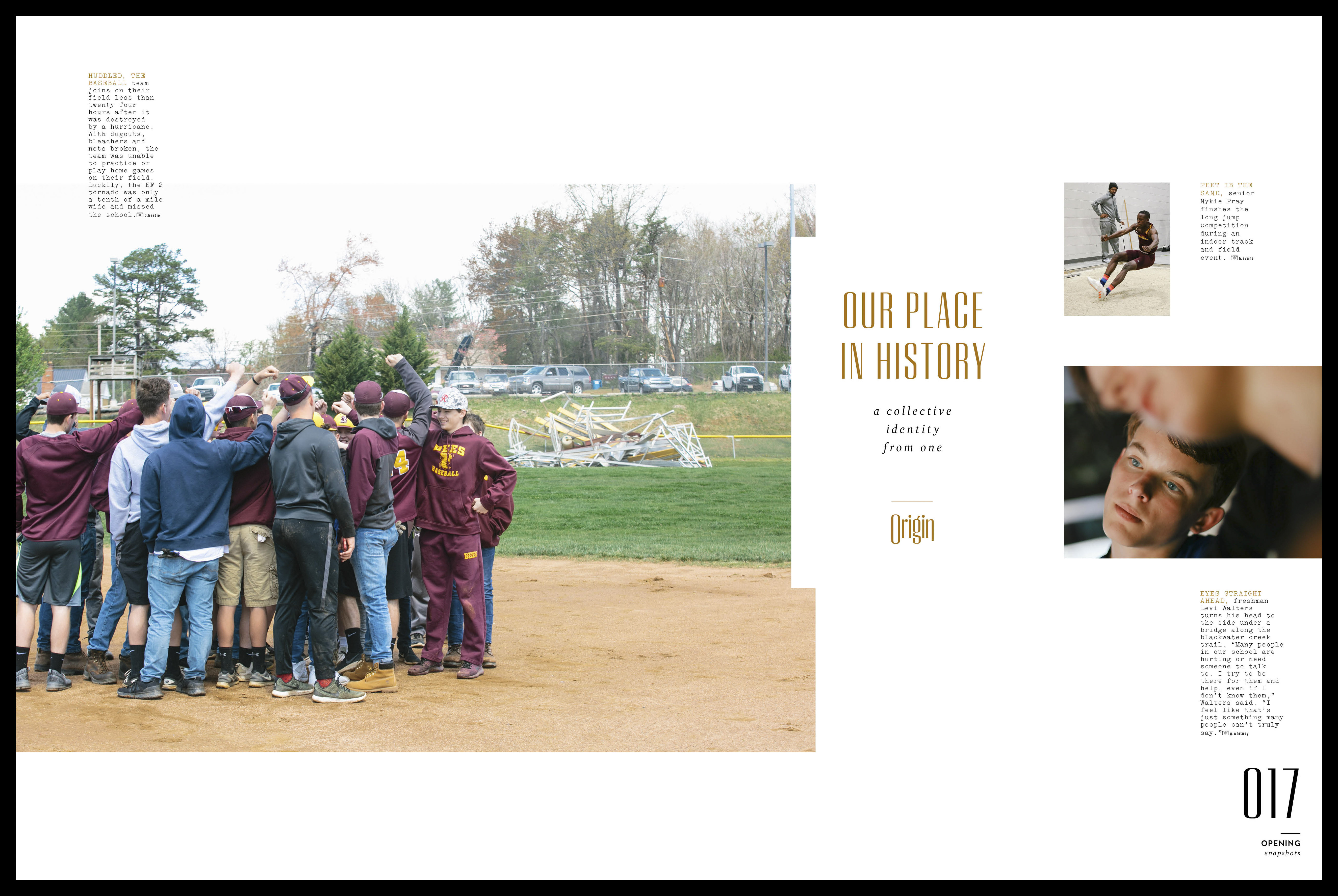
︎
C O N C E P T
// ORIGIN //
Raiding the archives for inspiration,
the team looked to establish a sense of place and identity
by pulling out structural and organizational elements
in aditional to visual cues from the vintage volumes.
︎
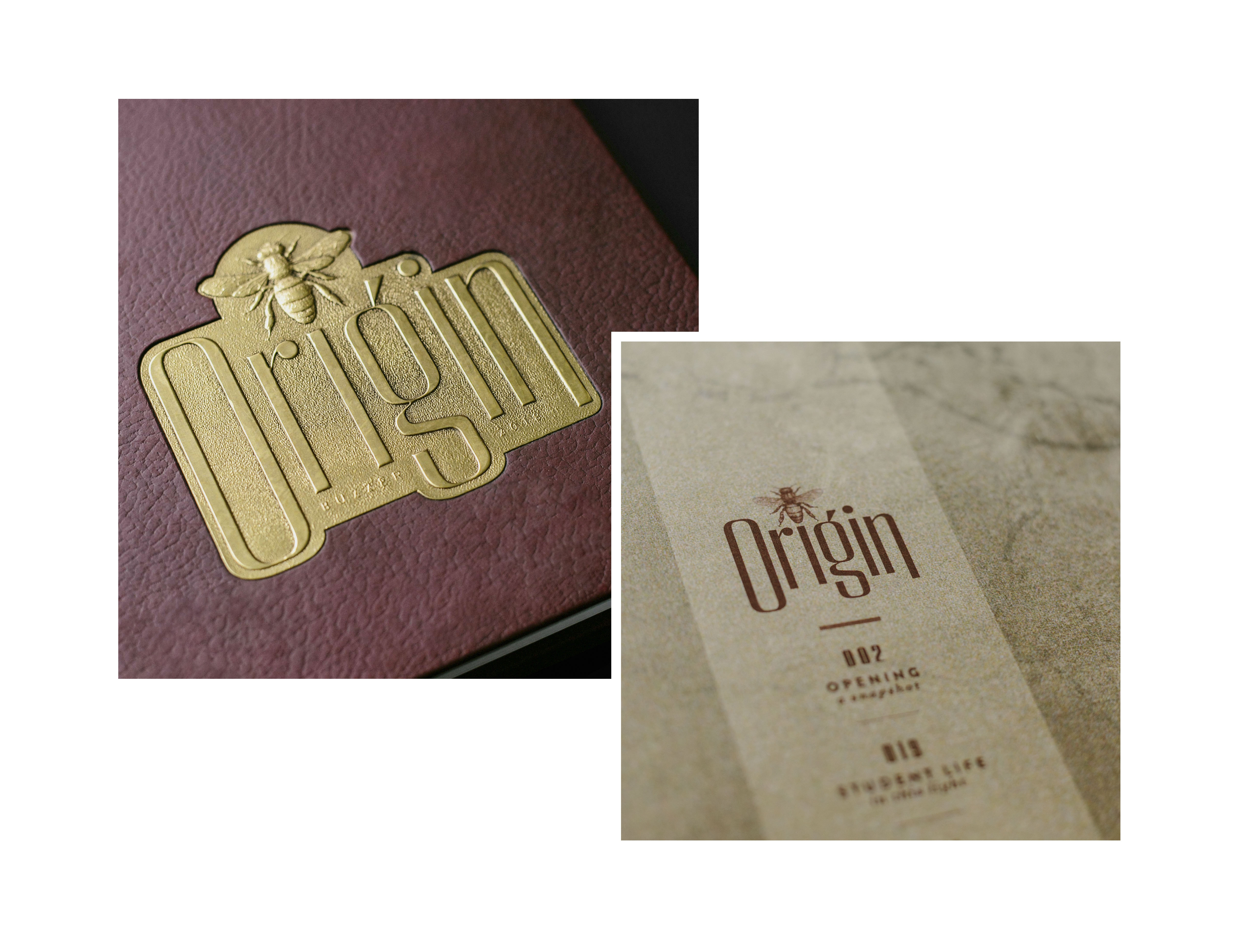
C O V E R
The idea was to consciously update vintage varsity aesthetics
while maintaining a classic feel. A pebble grain texture was applied
to maroon silktouch material and hand-finished with a black overtone rub.
This was wrapped on 145 point binders board. A custom embossed metallay
displaying the concept logo and burnished with an overtone rub
to bring out the detail, completes the look.
︎︎︎

︎
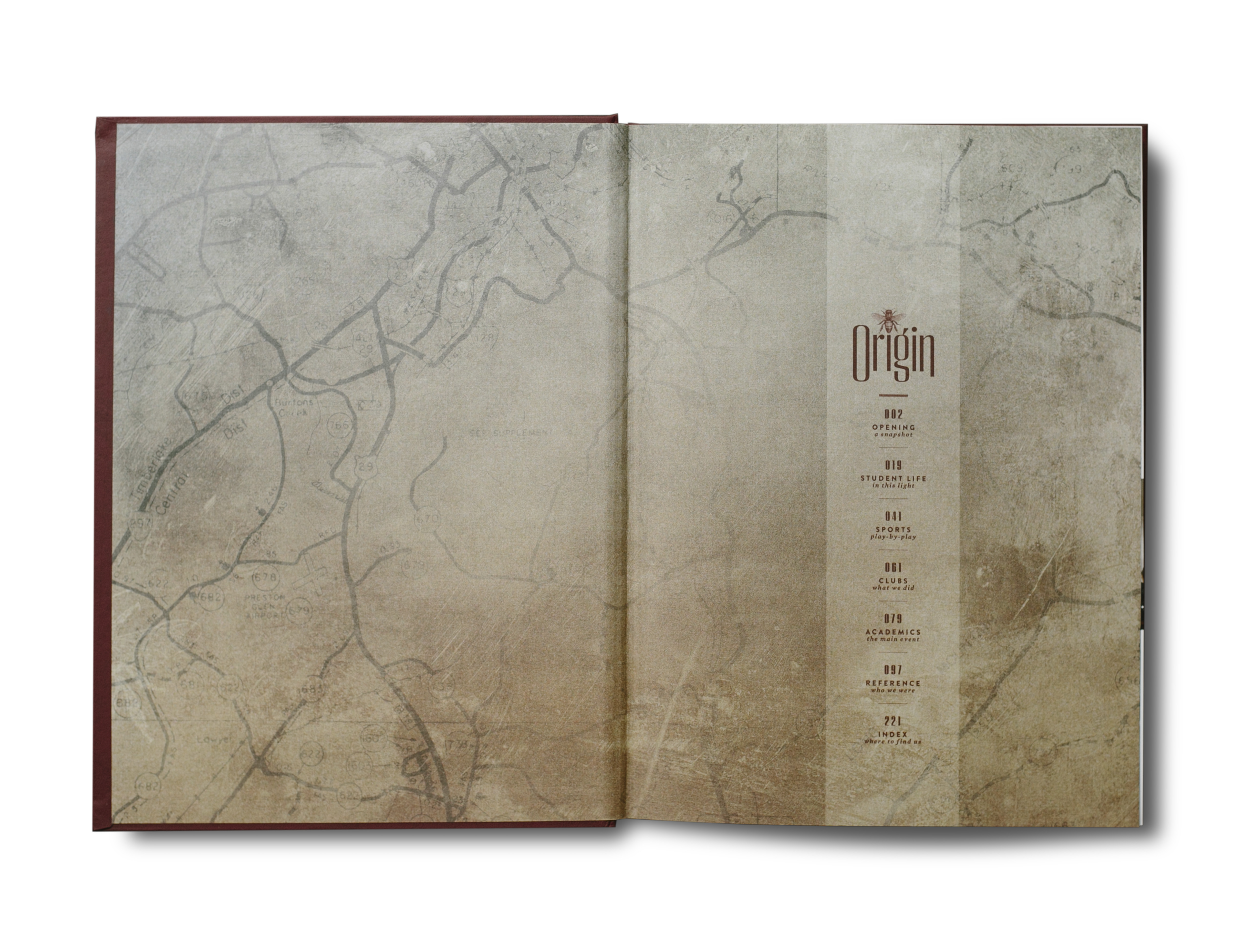
E N D S H E E T S
A giant cyanotype blueprint of the county dating
to the 1940’s found in a storage closet was a tangible
connection to the concept. Photographed and then formatted,
this graphic treatment was printed in process color
on a classic white stock. The front set features a concise
table of contents. The rear set refers readers back into the pages
of the book with a list of stories the editorial
team chose the highlight.
︎
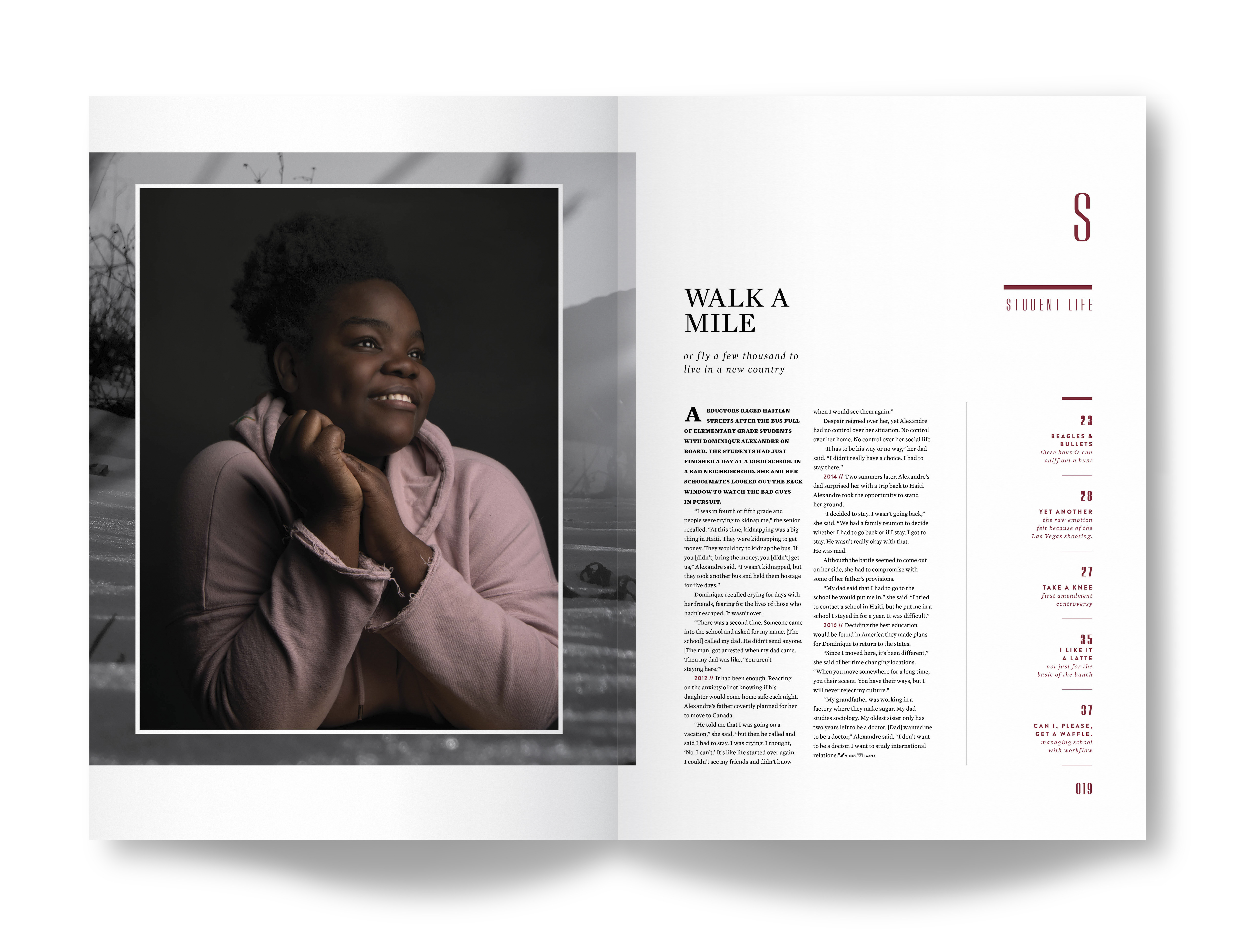
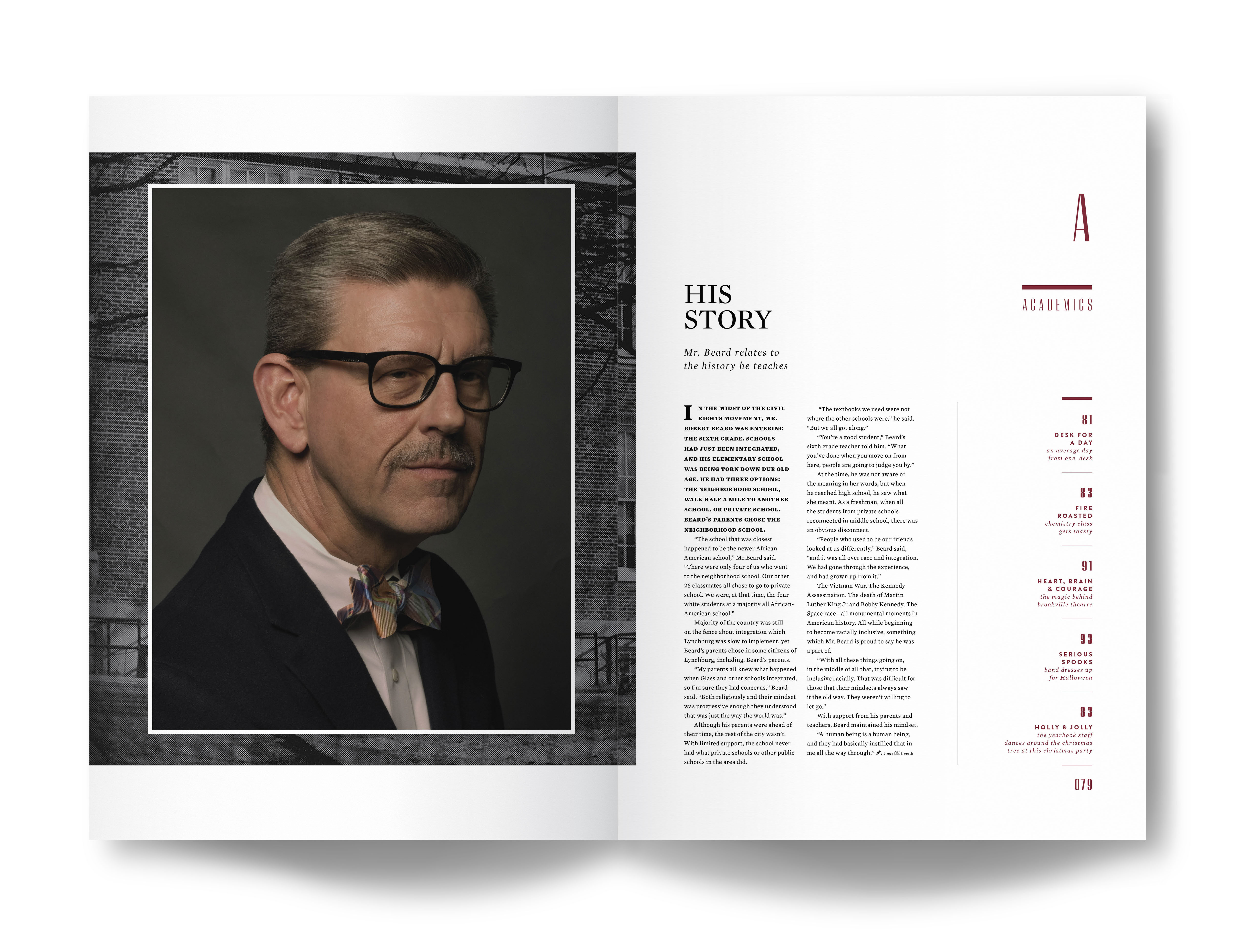
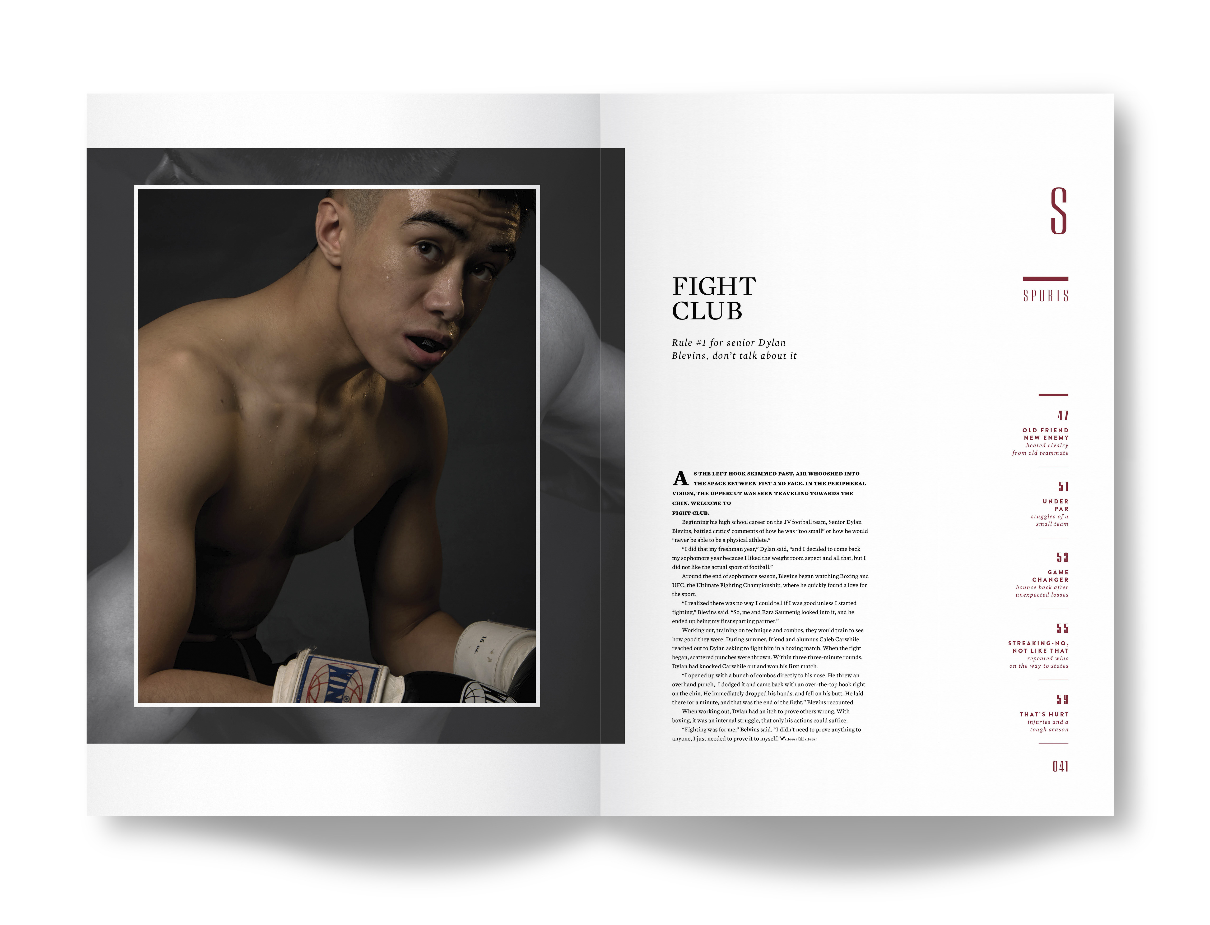
S T R U C T U R E
In the archives, the team identified a clear
organization of content and wayfinding cues—
no abstraction to confuse the reader. Following this lead,
the volume broke down into traditional sections. Chapter dividers
became a double exposure with classically styled portraits
layered with photo art created in-house. A secondary level
table of contents appears on the right side, teasing
content with a custom tag (i.e. you won’t see
the same headline twice).
︎︎︎